BETTOR SIGNALS - design phase
How does Margarita - our UI/UX designer, deal with designing betting and affiliate product?Designing betting products may seem tedious at first glance: a lot of text, numbers, tables, and so many unknown and incomprehensible words like markets, odds, parlays, and stakes.
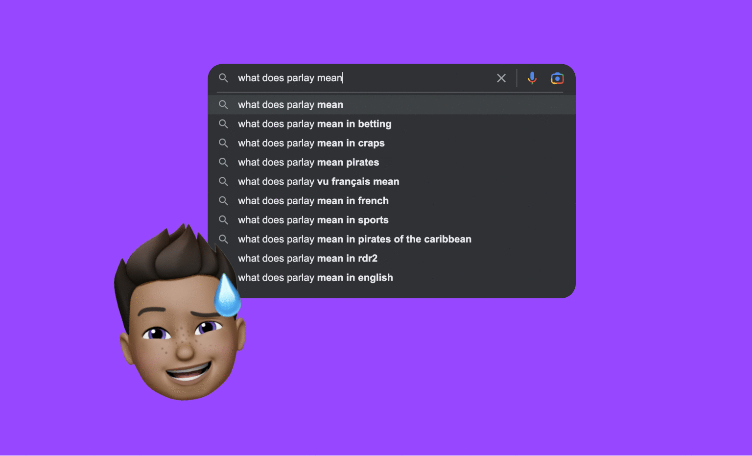
What do parlay and other betting words mean?
Overwhelming, I know 🥵 In this article, I want to share my experience of designing a sports affiliate platform from scratch and show that this industry is not as dull as it may seem.
BettorSignals.com is a project we are working on as part of R&D at TDSOFT. Today I will answer three short questions to describe the product design process from the idea to the launch of MVP v1.
Three simple questions – What? Why? How?
What is this product?
BettorSignals is a system that sends you brief sports tips called signals through posts and messages on the website and on social media platforms.

Brief sports tips called signals
BettorSignals is your buddy on the phone who knows everything about sports betting and can recommend precise tips for tonight's matches.
Why did we decide to start a new betting project since many betting products are already on the market?
Firstly, the competition always motivates you to create a better product and constantly evolve, add additional features, and offer new and better solutions for bettors.
From the beginning, we wanted to create a page different to what's now considered a standard.
During the design phase we made sure our page is not just another website with tips, but something more, something that is ready for the next generations of punters.
Secondly, there are countries where the sports betting potential is enormous, and in some countries like Canada, for example, sports betting is only beginning to be legalized.

Our target territories for bettorsignals.com
How?
Working on this project differs slightly from the generally accepted product design process. Your design process may, of course, vary, and this is normal. Our whole process can be divided into four steps.
1. Brainstorming
We had several meetings dedicated to gathering ideas. We were very motivated, so there were a lot of thoughts and information. After a few hours, we needed to sort all our ideas into three groups: "NO," "YES," and "FOR THE FUTURE."
I enjoyed our process, and if you have never tried brainstorming in the early stages, I highly recommend trying it with your team.

Sorting ideas into three groups: No, Yes, For the Future
💡 The first group included ideas that ultimately did not suit our concept or ideas that we wouldn't want to implement into our product, but they exist, for example, in our competitors’ products.
💡 The second group consisted of ideas and solutions that already exist on the market and are firmly embedded in the perspective of designing betting products (filtering by sports, for instance). This group also included completely new ideas for this industry, which we would like to implement.
💡 The third group represented creative and innovative ideas, but ones we decided to leave for the future due to short deadlines.
That last group is a treasure trove of ideas, and we are waiting for the following releases to implement some features from the list.
This stage helped us define the purpose of the product, its key functionalities, and how we want to deliver it.
2. Sketching
A pencil and paper are all you need to create the basic composition. This step didn’t take long because I had a vision of this product while sorting ideas.
3. Branding
Personally, my favorite part of this project! I watched a dozen pages of our competitors with the understanding that we needed something original. We started by compiling a list of the qualities we wanted to be characterized by. The list included:
risk
friendliness
emotionality
positive energy
the game's vibe
fun
sociability
Next, we moved towards archetypes to make the whole image consistent and choose the right tone for the brand's communication with its recipient.
What are archetypes in marketing and what are they for?
Simply put, an archetype is a set of characteristics that describe a character, event, or in our case, a brand. The archetype lets you put a face on the brand, defining its personality.
There are generally 12 archetypes. Based on the identifications we chose, the Jester archetype suited us the best (for better understanding, M&M's, Old Spice, and Fanta have the same archetype).
Based on all our information, we chose two primary colors – pink and purple, which are vibrant and energetic. You do not often see these colors in the betting industry, so we took a risk by choosing them. After all, we are in the gambling industry and risks are in our DNA.

All 12 marketing archetypes
4. Designing
Creating designs was the last step on this list, but certainly not the last one in the project.
How is bettorsignals.com fundamentally different from other platforms?
Feed view – an essential part of this page. The signals appear as messages in the feed, like on Twitter or Facebook. Users interact with social media every day, which means they are accustomed to a feed view. Also, a feed lets you consume content faster and more efficiently than, for instance, articles – everything you need is on one page, without the need to click to reach subpages.

Feed view on the main page
The widget with odds and the total sum is located under the message in the signal frame. This option is already available on all bookmaker websites, but we offer it to the user to see it before choosing a bookmaker. It helps to calculate the amount of your winnings depending on the stake.
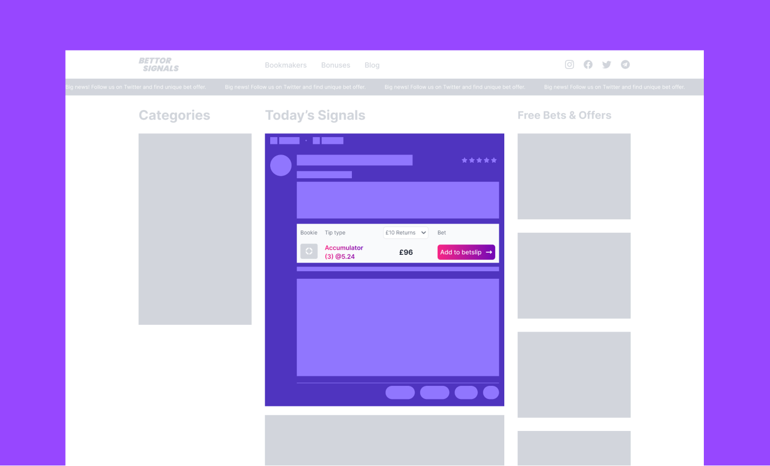
The widget with odds and total sum
Bookmaker buttons – each signal offers the user several bookmakers where he can bet on his tip.

Different bookmaker buttons
Bookmaker offers on the right. Offers are a feature from the second group. It is a required section for all sports affiliate platforms. However, we did not want to take standard offer designs from our affiliate partners but create custom ones that would nicely blend in with the page and our unique design system.
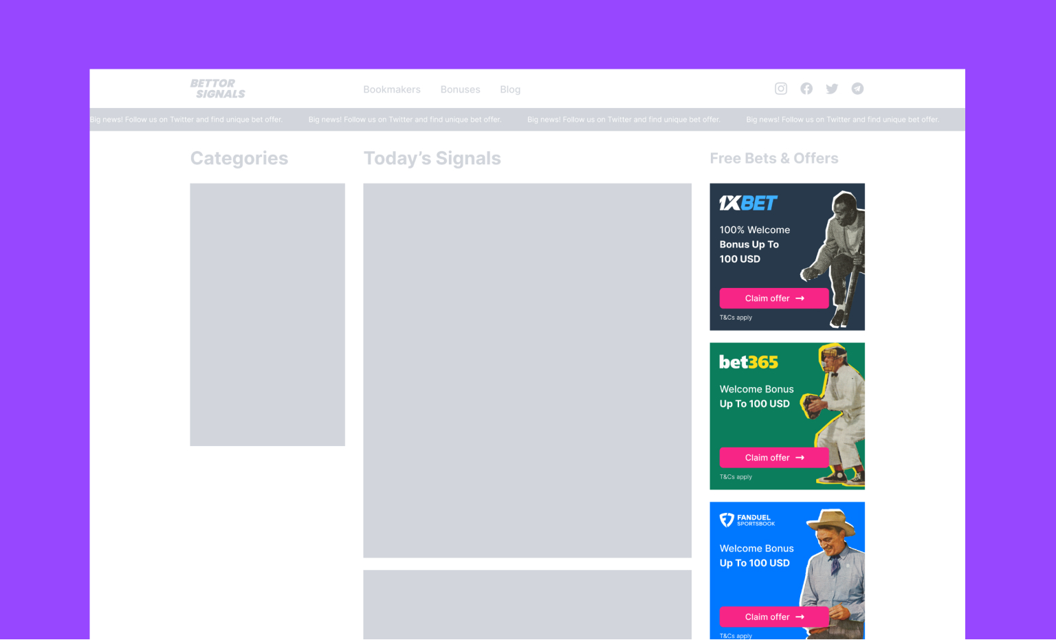
Custom design for bet offers
The „Message of the Day” component at the top helps us show the most important news. While launching the website, we encouraged users to follow us on social media; during the 2022 World Cup in Qatar we notified them about the beginning of the event. Light and smooth animation perfectly catches the user's attention, but you must always be careful with speed and frequency to avoid annoying your users.

“Message of the Day” under the header
Bright colors and bold accents of purple and pink allow us to maintain good readability and make it easier for our users to consume the content.
As I wrote before, in MVP v.1 we concentrated on essential items like the signal's messages and betting offers. There are a lot of features to implement (like the user's profile or comments under the signals etc.), user tests, new challenges, and exciting work ahead of us.
You can see the effects of our work yourself at bettorsignals.com or visit our Behance profile.
Follow us also on social media and stay up to date with our betting news and predictions:
👉 Telegram
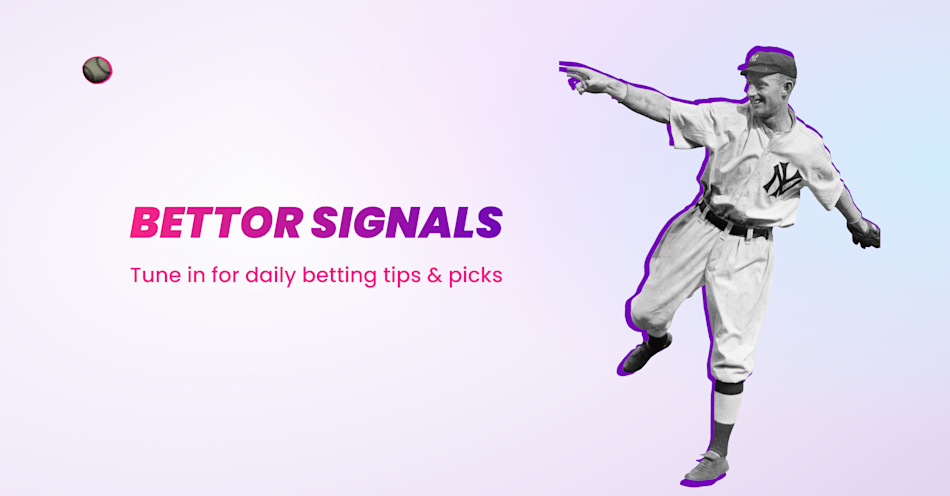
BETTORSIGNALS our new betting and affiliate product
We made this betting and affiliate platform totally from scratch. We started with conceptual work, then some market research, design, and lots of coding. The majority of the work is done, so we want to show you the results.